To provide the fastest user experience while at the same time reducing traffic costs, we use Bunny Optimizer to resize images on-the-fly. There are two approaches:
- If we know the visual dimensions, use src= directly
- If the image dimensions is responsive, use srcset
To use src= directly, the example is in CampaignList component:
<ProCard>
  {campaign.coverPhotoUrl && <img src={`${campaign.coverPhotoUrl}?aspect_ratio=16:9&width=400`}
    alt={campaign.title} title={campaign.title}
    style={{objectFit: 'cover', height: 200, width: '100%'}} />}
  {!campaign.coverPhotoUrl && <div style={{height: 200}} />}
</ProCard>
Result:
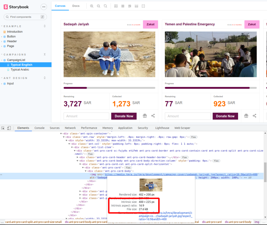
The resulting image is resized by Bunny, to appropriate aspect ratio, it becomes 400 px in width, converted to WebP format (since Chrome supports it), with final size of 27 kB. The original image is 1000 px wide and 281 kB size.